
Ben Wille
Tenacious Problem Solver

Description
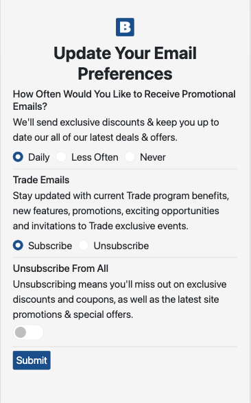
At Beyond, we built a custom preference center with our ESP, Braze. The problem was that a custom preference center is hosted with Braze and they display your code inside an iframe.
iframe’s are notoriously hard to work with because the iframe is treated like a separate page. Any changes to the container page, don’t make it to the iframe. Specifically, responsive design. There are plenty of blogs out there on how to create responsive iFrames, but those usually talk about iframing media, such as a YouTube video. In my case, it was text and form elements.
The solution
It isn’t super elagent, but the problem was the iframe didn’t know to increase the size of the elements because it thought the screen size never got smaller than 980px. I’m not sure if that is all iframes, but it was in this case.
I used javascript to look at the difference between the screen width and what the iframe thought the width was (window.innerWidth). Then I just increase the font size of all the elements by that modifier. So if the iframe thought it was 30% bigger than the actual screen size, then the font-size increase 30%.
function increaseSize(modifier) {
    all.forEach(function (element) {
	if (element.tagName == "H1") {
		element.style.setProperty("font-size", "27px");
	} else {
		element.style.setProperty("font-size", "initial");
	}
	let e = getComputedStyle(element);
	let fs = e.fontSize;
	fs = parseInt(fs);
	fs = fs * (1 + modifier);
	element.style.setProperty("font-size", fs + "px");
    });
}
function fontResize() {
	if (screen.width < 980) {
		var sizeModifier = (980 - screen.width) / screen.width;
		increaseSize(sizeModifier);
	}
}
var all = document.querySelectorAll("main *");
window.addEventListener("resize", fontResize);
fontResize();
Client
Braze